(1)
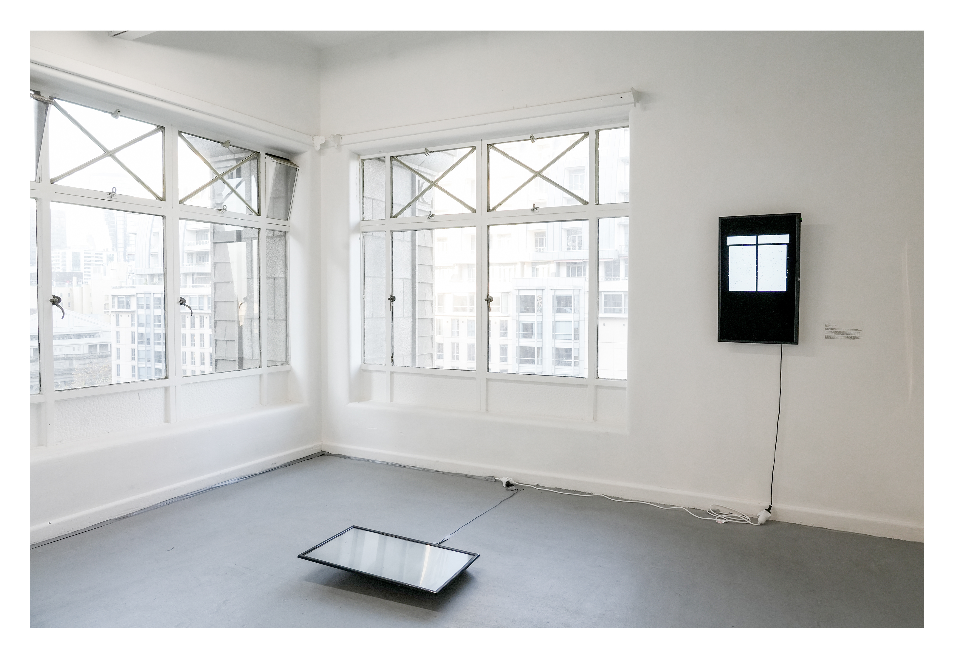
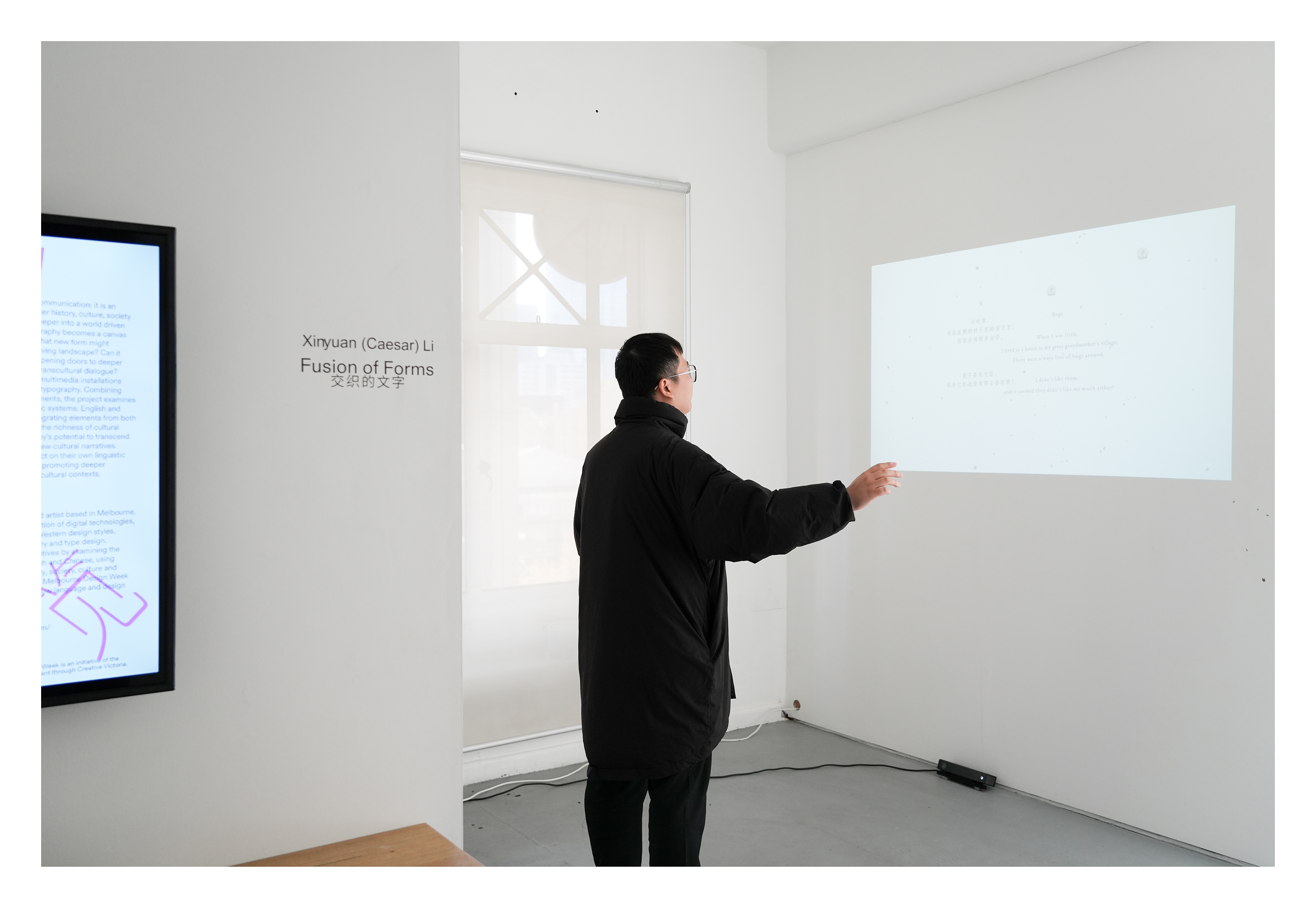
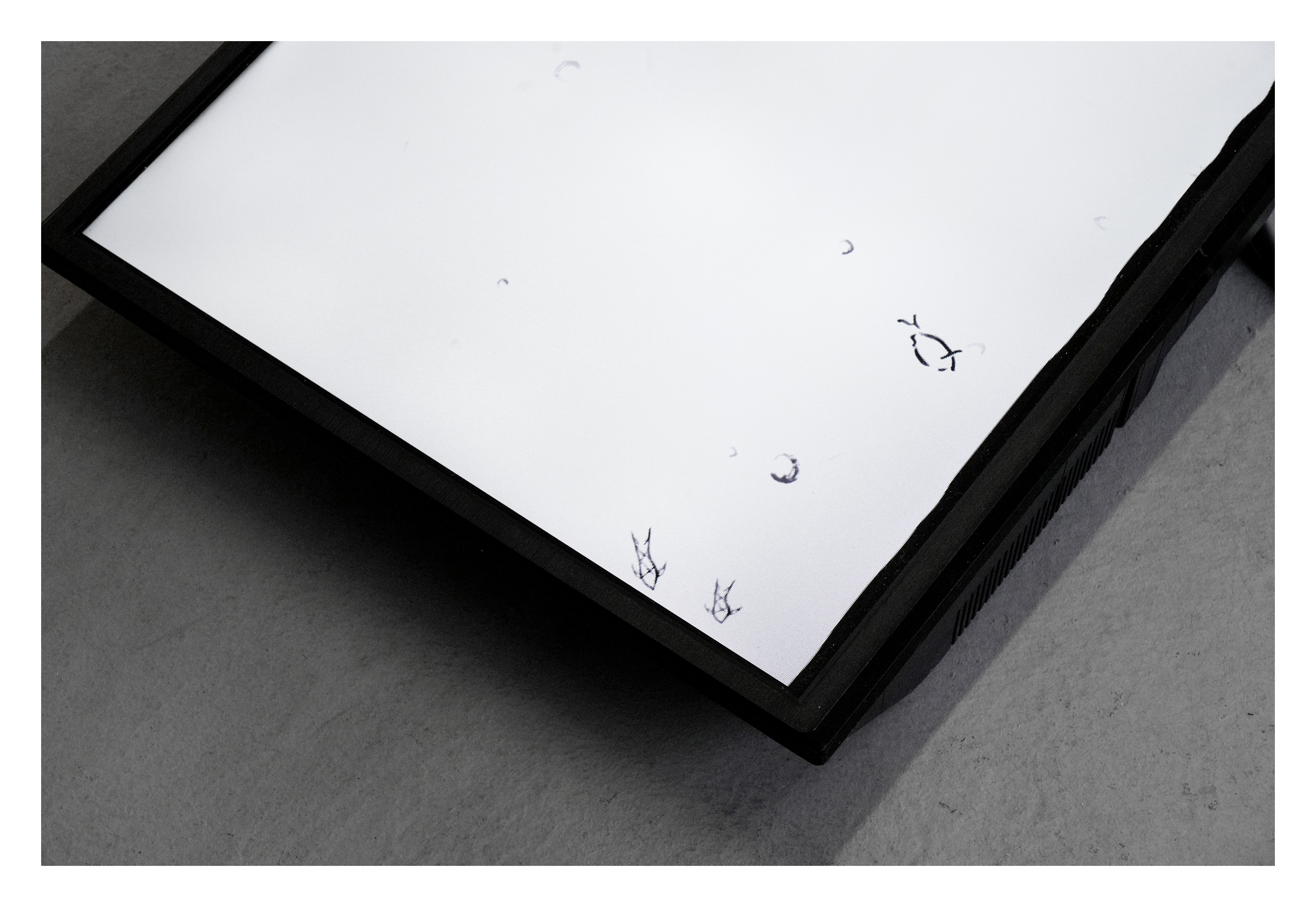
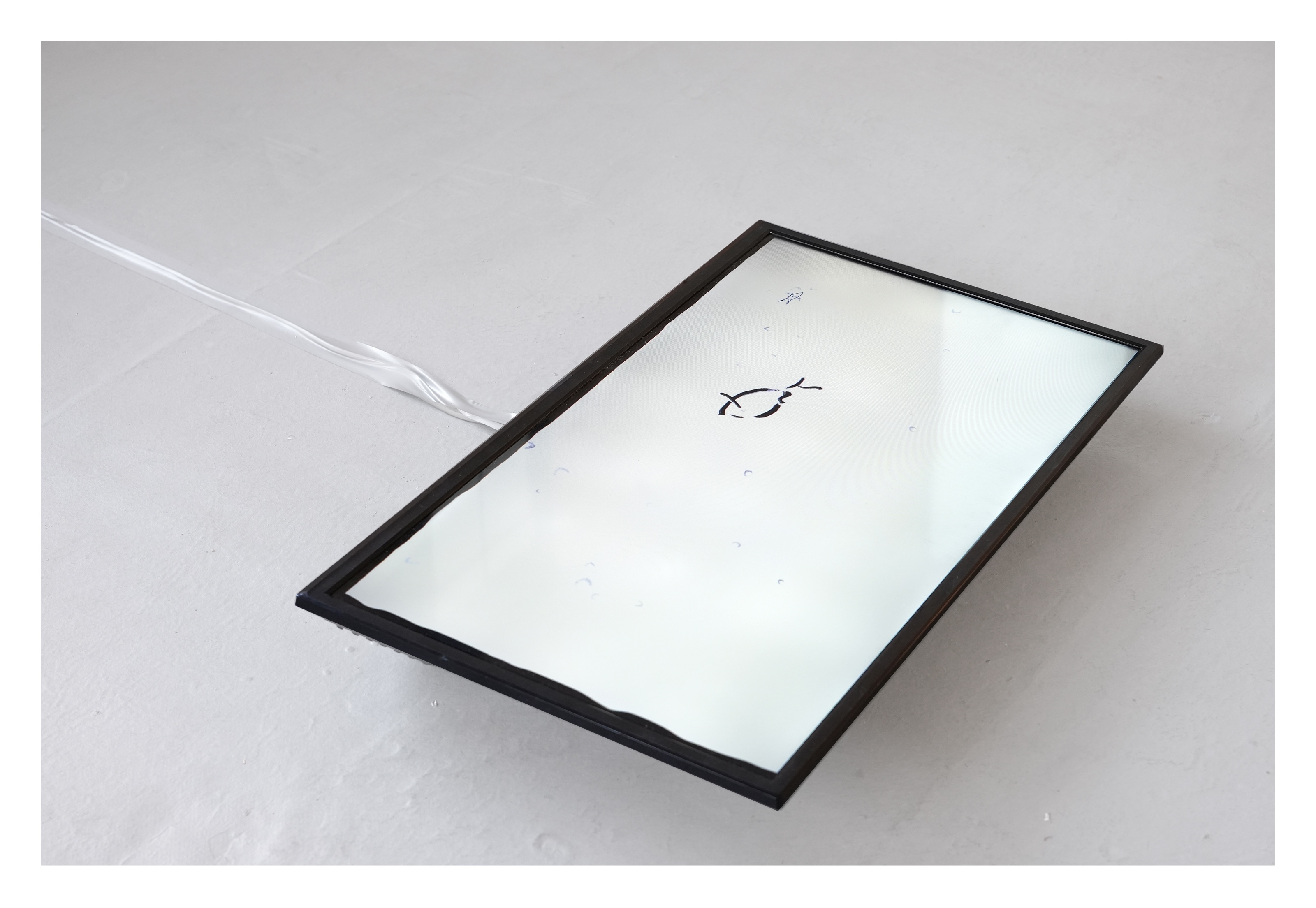
Fusion of Forms/交织的文字, 2025
Experimental Design/Billingual Typography
Fusion of Forms/交织的文字, 2025
Experimental Design/Billingual Typography
Designer: Xinyuan(Caesar) Li
Sound Edit: Benjamin Woods
Photography: Rohan Hutchinson
3D Clock Demo: Zhen Xiong
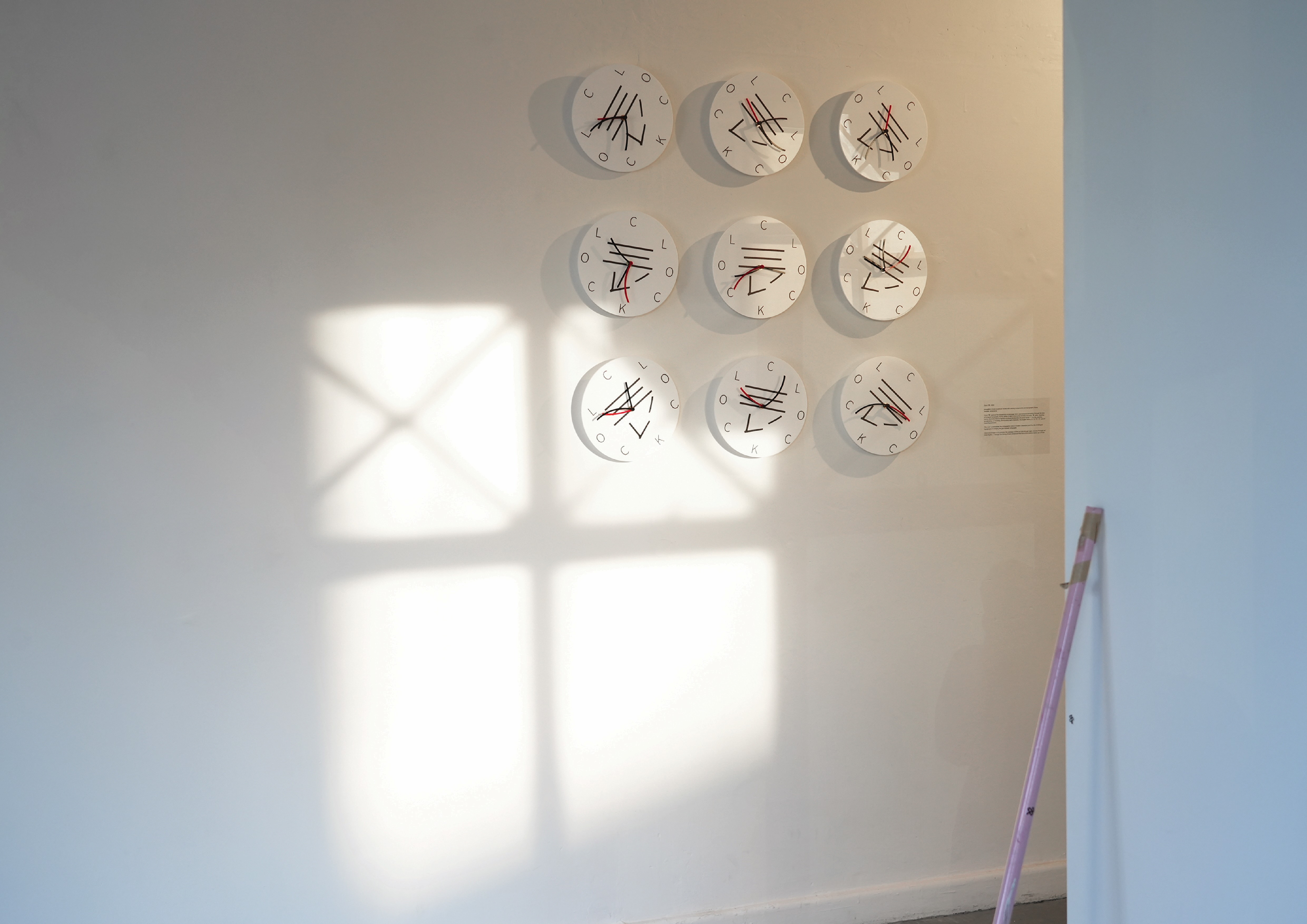
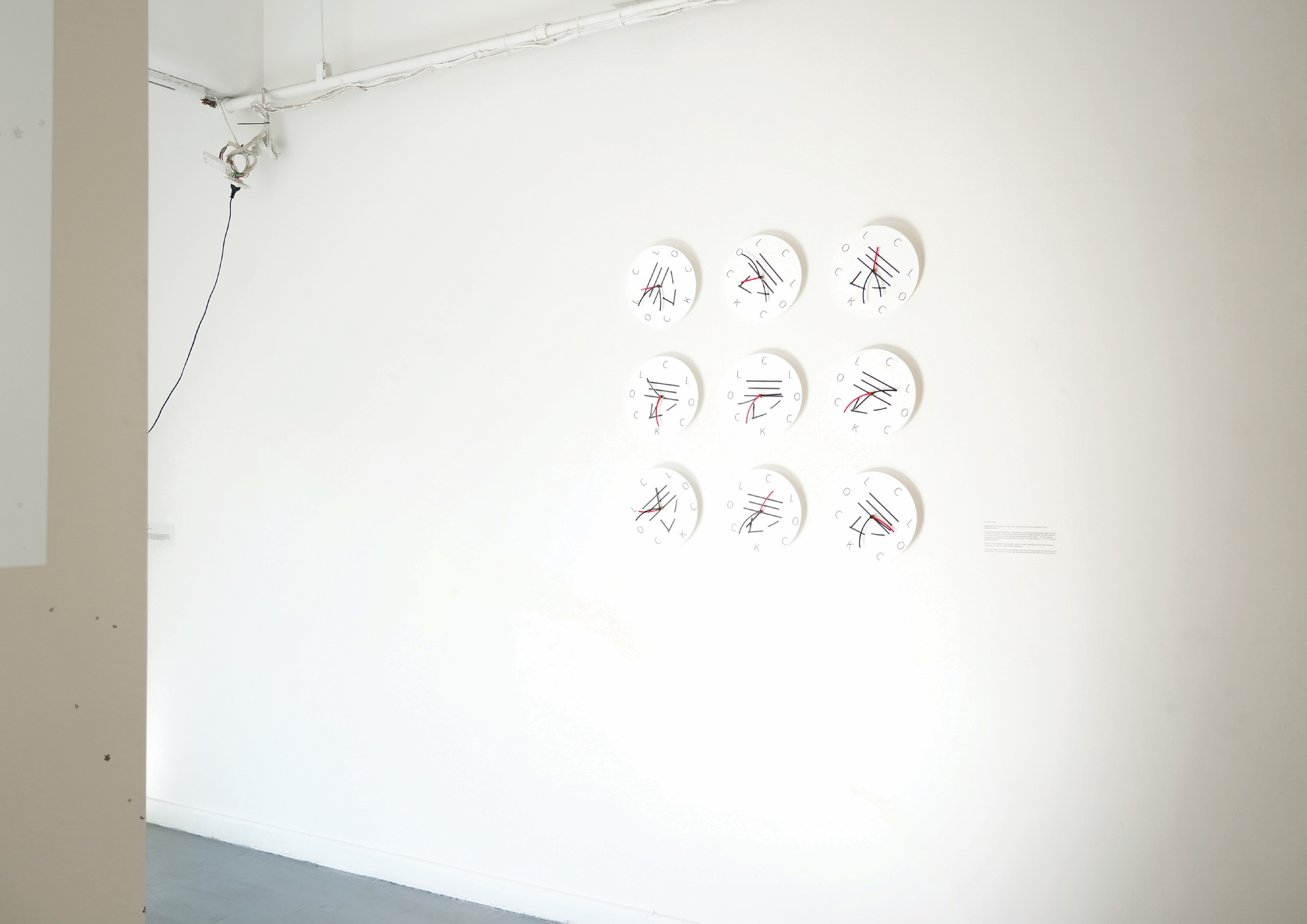
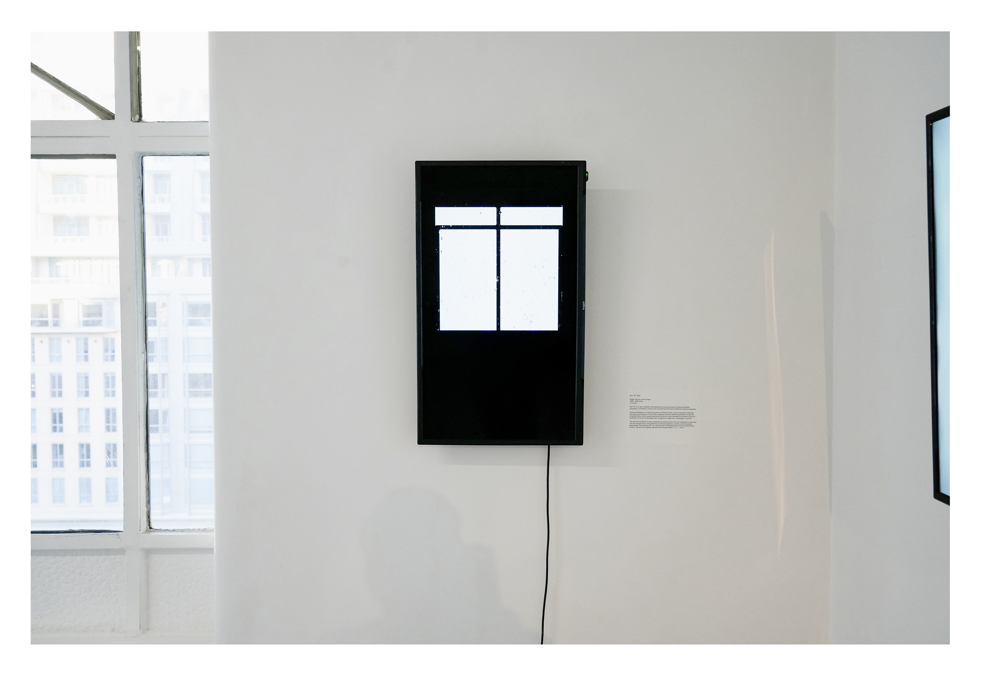
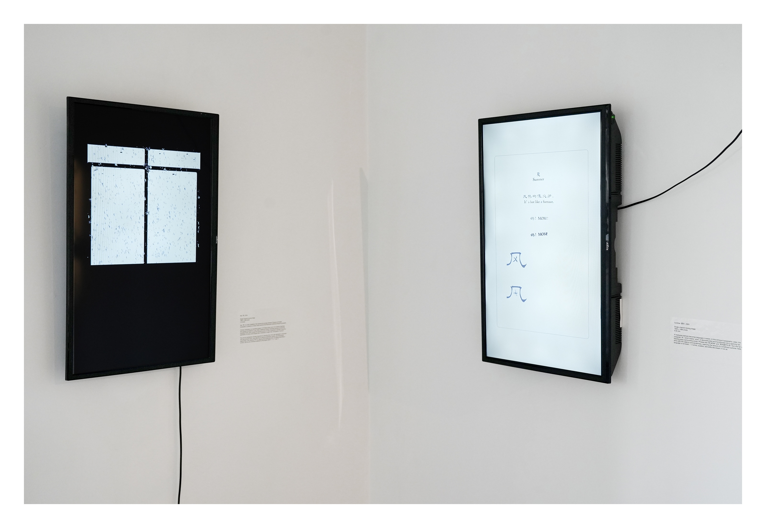
Typography is not only a tool for communication but also an invisible thread weaving together history, culture, society and technology. In today’s digital age, typography encounters both new opportunities and numerous challenges. What new forms can bilingual typographic design take? Can it serve as a bridge connecting different worlds and cultures, paving the way for deeper mutual understanding and meaningful cross-cultural dialogue? Fusion of Forms is a series of multimedia installations focused on innovative Chinese–English bilingual design, presented in a solo exhibition at the 2025 Melbourne Design Week. By integrating motion graphics and interactive technology, the works combine traditional typographic logic with digital experimentation. Through deconstructing and reconstructing writing systems, the project explores visual possibilities for bilingual narrative in screen-based, digital contexts.
In "Fish", the English word Fish takes the form of a pictogram, swimming alongside Oracle Bone script characters across the screen, hinting at a subtle symbiosis between civilisations. "Rain" reinterprets the structure of the Chinese character “雨” (rain) as a window frame, with its four dots transforming into the letters “r”, “a”, “i”, and “n” together depicting raindrops falling past a window. Set within Melbourne’s multicultural environment, Fusion of Forms is not merely a formal experiment—it is a practice of social design. Through the interaction and fusion of Chinese and English writing systems, it invites the audience to engage by viewing, participating and conversing, creating a layered experience that promotes cross-cultural understanding and reflects on contemporary issues of language, identity and coexistence.
文字排印 (Typography),不仅是沟通的工具,更是编织历史、文化、社会与科技的无形纽带。在数字化的今天,文字排印既迎来新的机遇,也面临诸多挑战。在此背景下,双语文字设计将呈现怎样的新形态?它能否成为连接不同世界与文化的桥梁,开启更深层次的相互理解,促进跨文化对话? 《交织的文字》是一系列专注于中英双语设计的多媒体装置作品,于2025年墨尔本设计周个人展览中展出。该系列作品融合动态视觉与交互技术,将传统排版与数字实验方法相结合,通过对文字结构的解构与重构,探索数字语境下双语共同叙事的视觉可能性。
《鱼》将英文字母 “Fish” 构造成“象形文字”,与中文甲骨文在屏幕中共同游弋,隐喻不同文明之间的微妙共生。《雨》则将“雨”字的框架转化为窗格,四点水化作英文字母 “r、a、i、n”,共同营造出雨滴落下、透过窗户的景象置身于墨尔本多元文化的环境背景下,《交织的文字》不仅是一项形式上的实验,更是一场社会设计的实践。它通过中英文字体系的交融与互动,激发观众在观看、参与和对话中形成多重体验,从而推动跨文化理解的进程,并回应现代社会中关于语言、身份与共存的深刻议题。
Speacial thanks to the support from CAVES Gallery for the solo exhibition at Melbourne Design Week 2025.


(2)
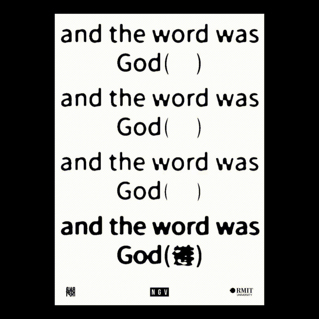
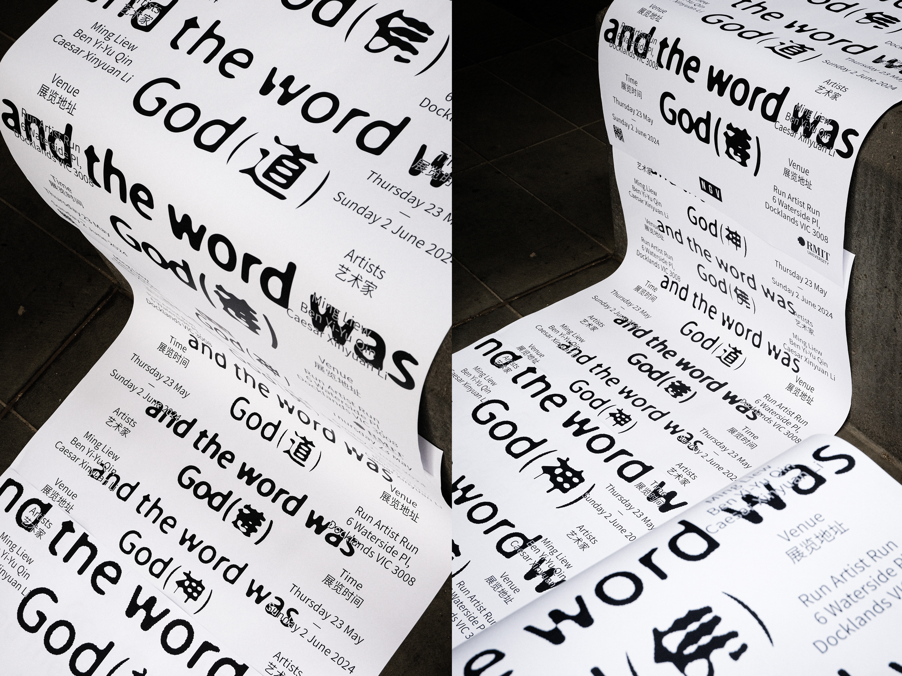
AND THE WORD WAS GOD (神), 2024
Visual Identity Design/ Poster Design
Creative Director: Xinyuan(Caesar) Li, Ben Yi-Yu Qin, Ming Liew
AND THE WORD WAS GOD (神), 2024
Visual Identity Design/ Poster Design
Creative Director: Xinyuan(Caesar) Li, Ben Yi-Yu Qin, Ming Liew
Art Director: Xinyuan(Caesar) Li
Designer: Xinyuan(Caesar) Li, Chin-Wen Hsu
Photographer: Chin-Wen Hsu
Writer: Ben Yi-Yu Qin
Motion Designer: Chin-Wen Hsu, Xinyuan(Caesar) Li
Exhibited at Run Artist Run studio for Melbourne Design Week 2024, "And the Word was God(神)" explores the evolution and transformation of language through the lens of three Chinese Australian artists. The exhibition delves into how language connects the past, present and future, highlighting the vibrant exchange between different cultures in Australia. Audiences are invited to reflect on their own linguistic experiences, promoting dialogue and understanding.
The poster highlights the intercultural hybridity between Mandarin and Latin texts through the word "God" and its interpretations in English and Mandarin, each bearing unique cultural connotations. “God” is often understood as the creator and ruler of the universe, the supreme or ultimate reality, whereas in Chinese language and culture, “God (神)” is a generic term and doesn’t refer to a specific god or spirit. It can be understood as a Daoist immortal (神仙), a supernatural entity, or a divine being.
To capture such nuances, in the poster, the concept of “God” is expressed through three Chinese characters, including "神" (God), "佛" (Buddhism), and "道" (Taoism), which signifies supreme power). By combining these characters, a new character is created to encapsulate the essence of these meanings, symbolising the intricate nature of intercultural translation. Using fluidity, blending, and repetition to symbolise how language can unify or divide, this innovative character invites viewers to appreciate the profound impact of communication on human connections.
Special thanks to the support from Run Artist Run.


(3)
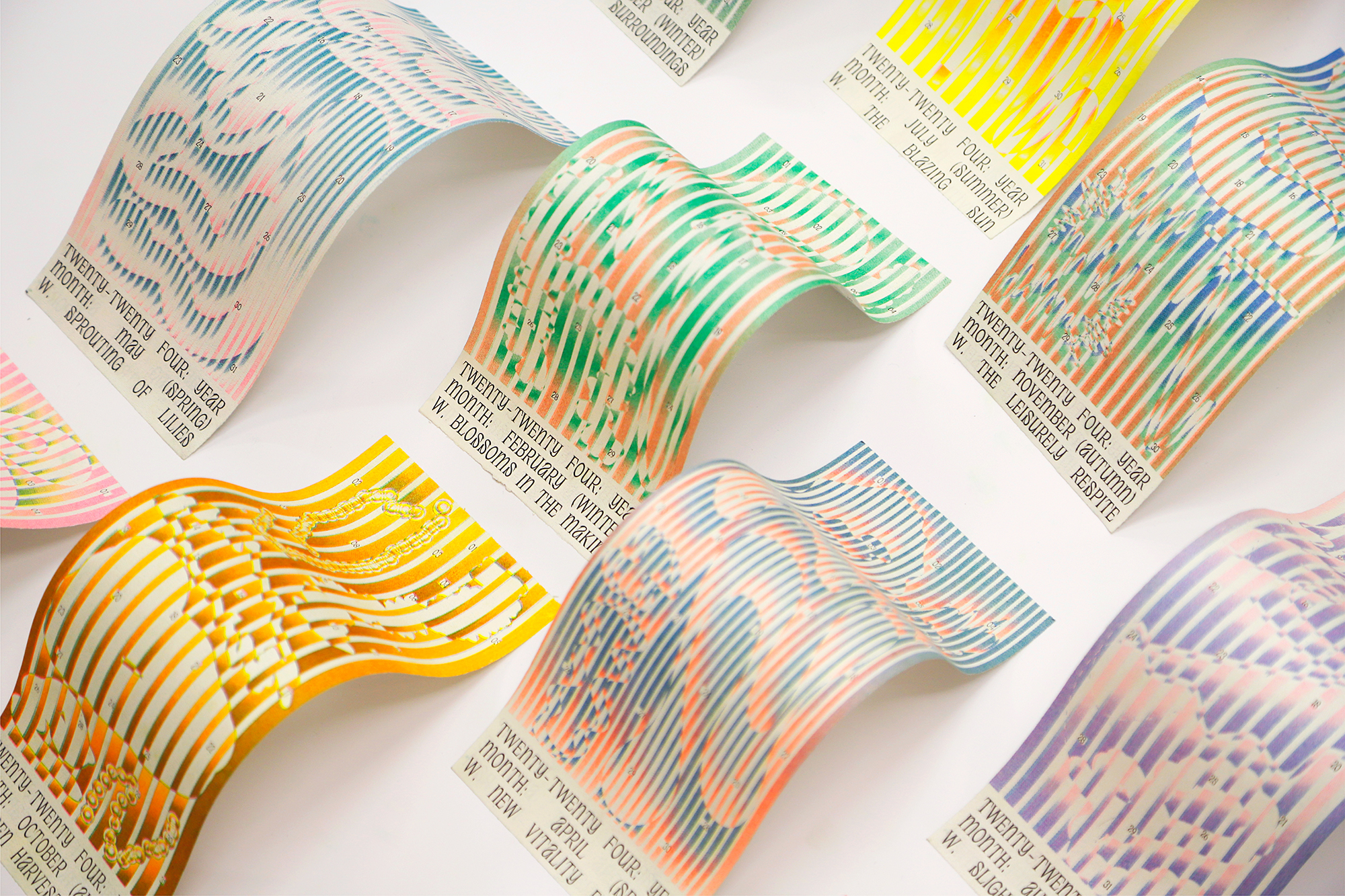
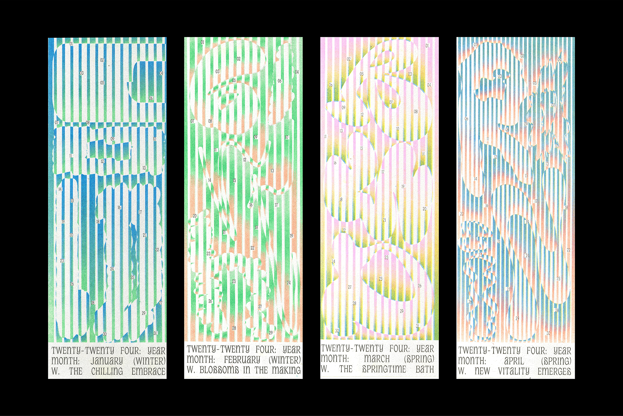
Season Type Calendar, 2024
Calendar Design
Project in Collaboration with:
Season Type Calendar, 2024
Calendar Design
Project in Collaboration with:
Haocheng Zhang, Ruiying Zeng
Photography: Haocheng Zhang
Printing: Shuai Shao, Jiayu Cheng
Season Type Calendar is inspired by the 24 Chinese solar terms. Through the exploration of “one scene, one window’, the calendar unravels unique narratives throughout. Through gradient, experimental, and playful type designs, the calendar delves deep into the potential of fonts in visual communication. Through this project, we challenge the constraints of traditional font design, using gradient colors to evoke different feelings and emotional resonance to changing seasons.
这个作品的创作旨在以中国的二十四节气为灵感,通过视觉元素“窗户”的概念,一窗一景,以渐变、实验性和富有趣味性的字体设计深入挖掘字体在视觉传达中的潜力。我们挑战传统字体设计的限制,运用渐变效果来唤起四季更替的感觉和情感共鸣,以字体作为媒介来反映人与自然的互动。我们的目标是塑造一种独特的视觉语言,使观众以崭新的方式理解和体验中国节气的文化内涵,深切体验季节变迁的美妙之处。通过这一实验性的探索,我们鼓励观众重新审视传统节气的呈现方式,并在现代视觉传达中发现中国传统文化与当代融合的全新可能性。
这个作品的创作旨在以中国的二十四节气为灵感,通过视觉元素“窗户”的概念,一窗一景,以渐变、实验性和富有趣味性的字体设计深入挖掘字体在视觉传达中的潜力。我们挑战传统字体设计的限制,运用渐变效果来唤起四季更替的感觉和情感共鸣,以字体作为媒介来反映人与自然的互动。我们的目标是塑造一种独特的视觉语言,使观众以崭新的方式理解和体验中国节气的文化内涵,深切体验季节变迁的美妙之处。通过这一实验性的探索,我们鼓励观众重新审视传统节气的呈现方式,并在现代视觉传达中发现中国传统文化与当代融合的全新可能性。


(4)
Something Like Dancing, 2024
Publication Design
Something Like Dancing, 2024
Publication Design
Artist/Author: Jacqui Shelton
Editor: Tim Coster
Designer: Xinyuan (Caesar) Li
Published by 3-ply, 2024
ISBN 978-0-6483942-3-5
Specifications:
Softcover, 150 x 214 mm, 52pp + 6 inserts, laser print
First edition of 82
Photography: Rohan Hutchinson, Lloyd Mst
Purchase Here︎
"Something Like Dancing is a one-on-one performance work that can be performed in quiet spaces such as a home, a studio, a park bench, or a library. Over the course of three sittings, a participant in the work will be taught to recite three stories by heart. As a book, Something Like Dancing is a collection of short essays and conversations that have come to be the only document of this one-on-one performance work that I performed over a period of five years. Many of these essays started as chapters of a PhD I wrote on the work, but in the intervening years have come to read much closer to how I speak. I don’t dance professionally, but I love to do so with friends – the same could be said for art."
The ephemeral, intimate, and poetic qualities of the performance art were central themes when Jacqui and I first chatted about this project over coffee. This led me to think deeply about how to visually express the fragility of narratives, the fleeting nature of memory, and the subtle tensions between communicators. These themes are conveyed through the interaction between the cover and dust jacket, where the characters gently blend into the background, fading with each page turn. The use of translucent, thin paper creates a layered effect, allowing text to overlap, intertwine, or even disappear under soft light, shifting with changes in time, environment, and weather.
The A5 format, paired with elements like clips, scribbles, handwritten scripts, simple print methods, and handmade bindings—common, almost modest forms—reinforces a sense of intimacy. The varied typeface usage, while sometimes unexpected and awkward, coalesces in a way that mirrors the nuanced balance of dialogue, echoing the conversational nature of the performance.
The combination of diverse materials, separate appendices, and varied visual forms and colours creates a publication that encapsulates the multifaceted nature of the performance—poised between the ephemeral and the enduring, the formal and the informal.
- Jacqui Shelton
The ephemeral, intimate, and poetic qualities of the performance art were central themes when Jacqui and I first chatted about this project over coffee. This led me to think deeply about how to visually express the fragility of narratives, the fleeting nature of memory, and the subtle tensions between communicators. These themes are conveyed through the interaction between the cover and dust jacket, where the characters gently blend into the background, fading with each page turn. The use of translucent, thin paper creates a layered effect, allowing text to overlap, intertwine, or even disappear under soft light, shifting with changes in time, environment, and weather.
The A5 format, paired with elements like clips, scribbles, handwritten scripts, simple print methods, and handmade bindings—common, almost modest forms—reinforces a sense of intimacy. The varied typeface usage, while sometimes unexpected and awkward, coalesces in a way that mirrors the nuanced balance of dialogue, echoing the conversational nature of the performance.
The combination of diverse materials, separate appendices, and varied visual forms and colours creates a publication that encapsulates the multifaceted nature of the performance—poised between the ephemeral and the enduring, the formal and the informal.


(5)
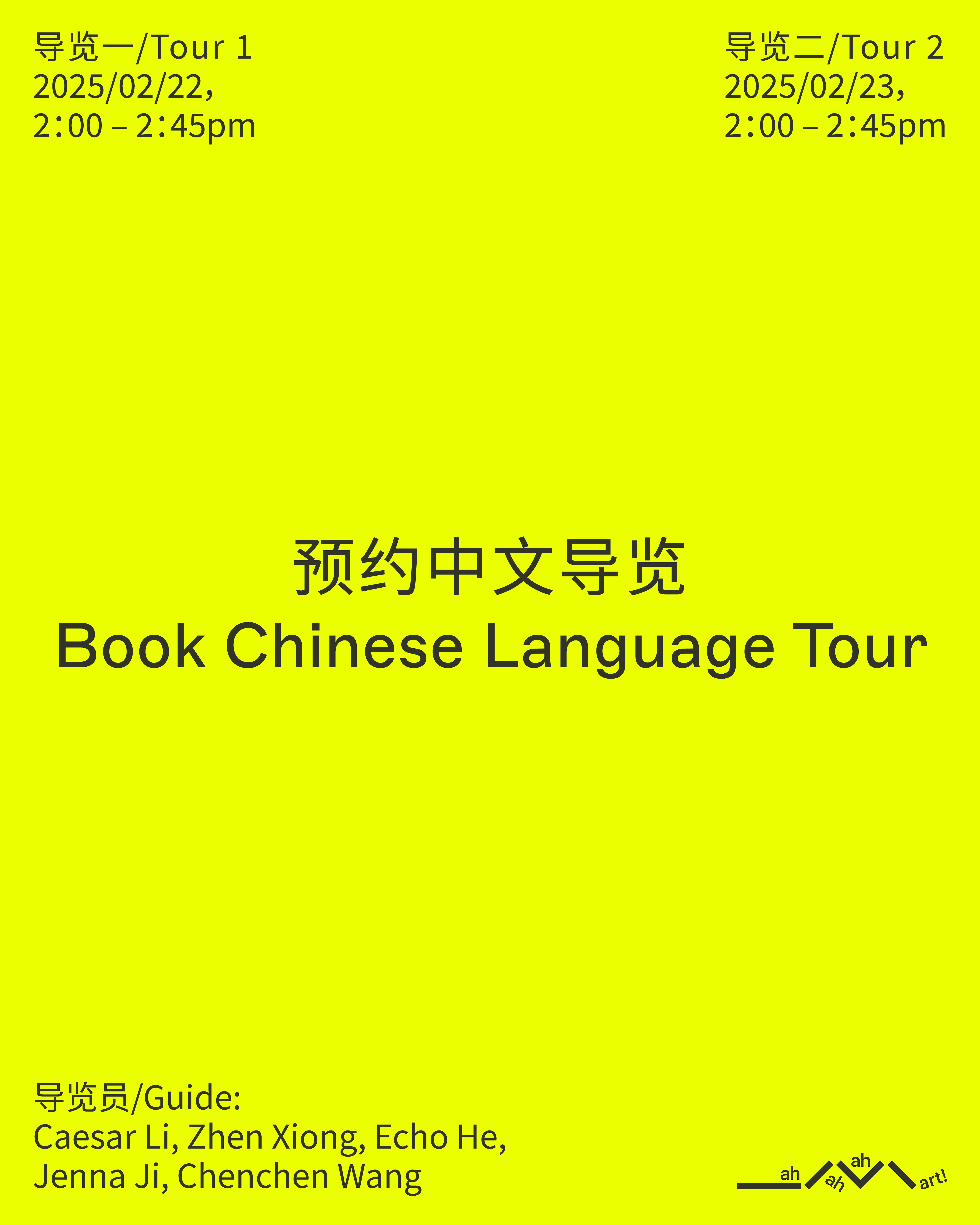
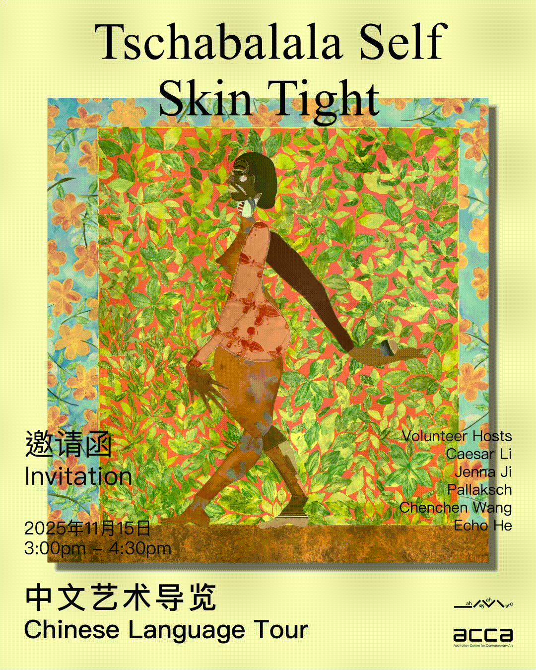
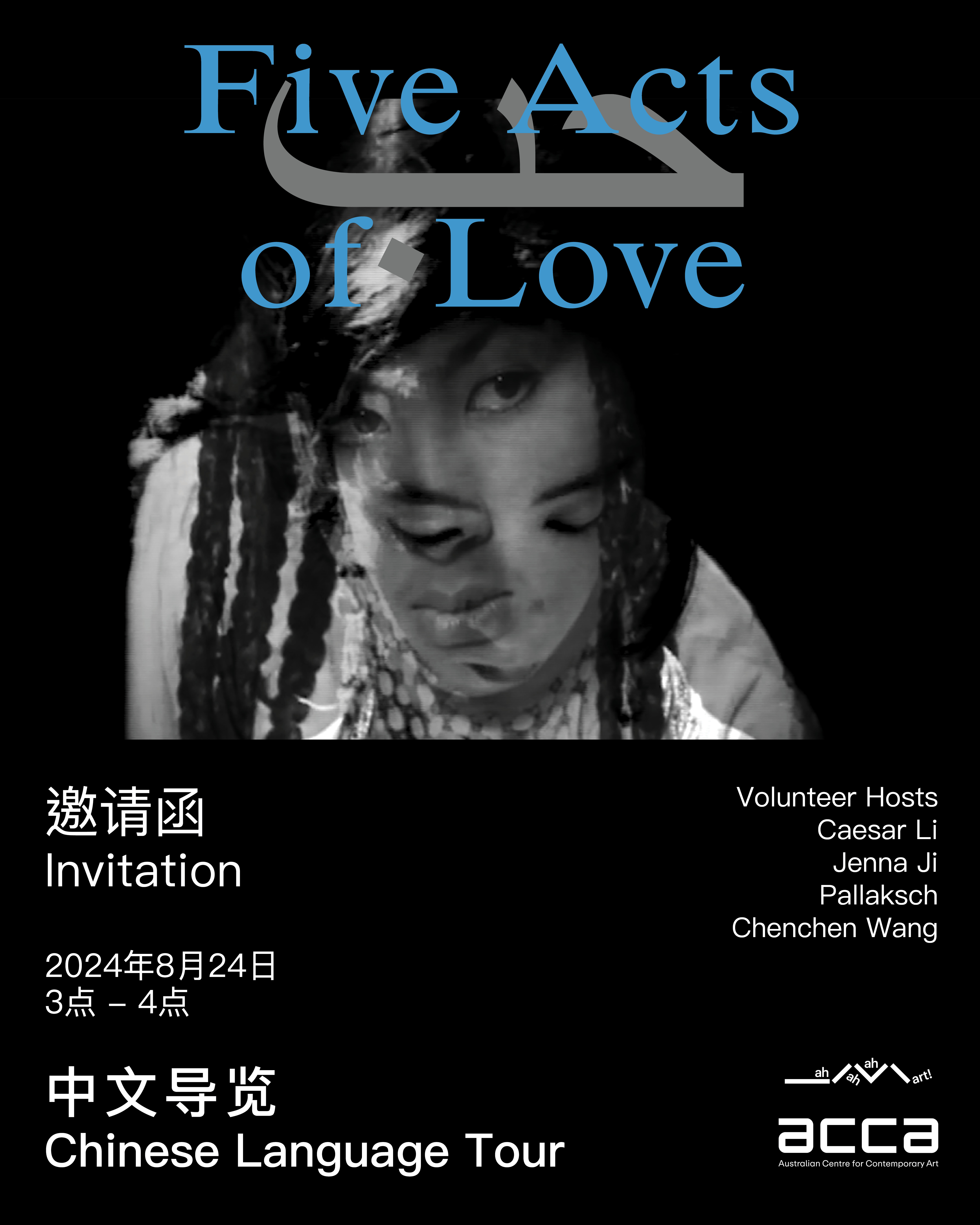
ah ah ah art! Chinese Art Club , 2023
Visual Identity Design/ Social Design
Designer: Xinyuan Caesar Li, Zhen Xiong and Evelyn Han
ah ah ah art! Chinese Art Club , 2023
Visual Identity Design/ Social Design
Designer: Xinyuan Caesar Li, Zhen Xiong and Evelyn Han
Photography: Echo He and Xinyuan Li
Special thanks to the support from Dr Fayen d’Evie, Max Delany and Laura De Neefe
Established in 2023 by Caesar Li, Zhen Xiong, Evelyn Han and Yue Yang in collaboration with ACCA, ah ah ah art! is a social art club for Chinese speaking communities to engage with contemporary art and artists. The group aims to further build understanding, awareness and support for contemporary art in Chinese speaking communities.
The name of the art club is derived from one of the most commonly used sounds in language, “ah”, which is often used to express exclamations, surprises, questions, and other moods. In the Chinese language, the four tones give the language different expressions and meanings, and the same expression exists in different cultures and languages.
āh: Thinking, Hesitating ; áh: Questioning; ǎh: Enlightening, “ah-ha” moment; àh: Surprising, Exclamation.
The name āh áh ǎh àrt! reflects our love for art and the endless possibilities of artistic expression. We encourage everyone to give “ah ah ah art!” their own unique interpretation by varying the length, tone, and meaning of the phrase, allowing for diverse perspectives and ideas to be expressed.
ah ah ah art! 是一个当代艺术社交俱乐部,由Caeser Li、Zhen Xiong、Evelyn Han和Yue Yang于2023年与ACCA(澳大利亚当代艺术中心)合作成立,旨在促进华语社区与当代艺术及艺术家之间的互动。该艺术俱乐部致力于增进华语社区对当代艺术的认知,理解以及提供相应支持。
艺术俱乐部的名称源自语言中最常用的声音之一,即“啊”,它经常用于表达惊叹、惊讶、疑问和其他情绪。在汉语中,四声调赋予了语言不同的表达和含义,而相同的表达方式存在于不同的文化和语言中。
āh:思考、犹豫; áh:质疑; ǎh:启发、“啊哈”时刻; àh:惊叹、惊喜.
“āh áh ǎh àrt!”这个名称体现了我们对艺术的热爱和艺术表达的无尽可能性。我们鼓励每个人通过改变短语的长度、音调和含义,赋予“āh áh ǎh àrt!”自己独特的解释,以表达多样的观点和思想。
Website: https://acca.melbourne/
Instagram: ahahahartchineseartclub